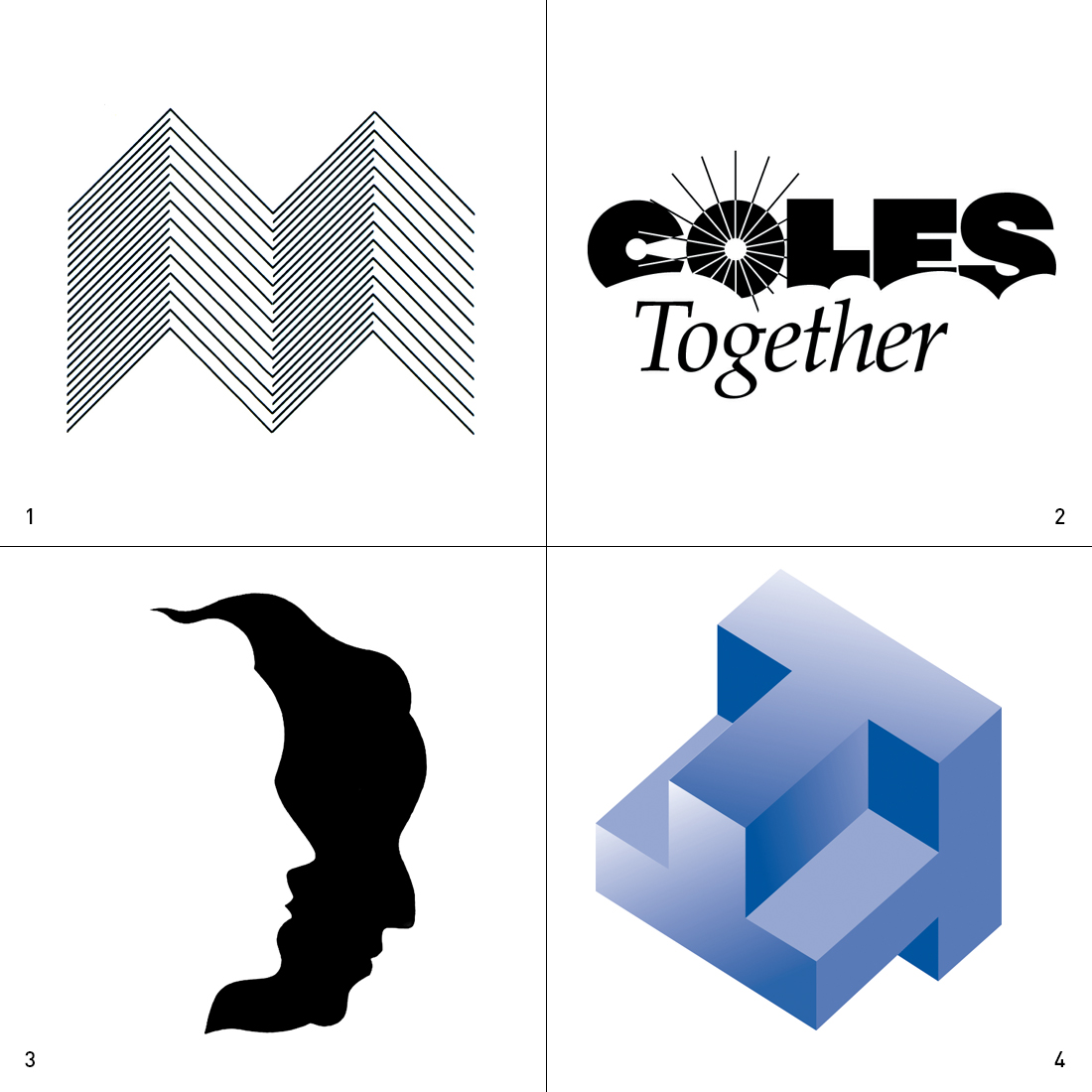


1. Anna Macedo and Company
This is a small graphic design consulting firm in Baton Rouge, Louisiana. They take pride in their special attention to paper and surface treatment on their projects.
The logo uses the M for Macedo and shows it as a three dimensional form, much like the image of folded paper or an accordion fold brochure.
2. Coles Together Economic Development Corporation
The corporation united numerous tangent cities of Coles County in east central Illinois to form one economic development corporation. This allowed for greater flexibility and capability in the offering of incentives to prospective companies considering locating in the area.
The logo confronts the word with the symbols of sun and sky to show that a new day is upon us and bright days are ahead – for both the communities involved and the prospects that will relocate.
3. Arkansas Plastic Surgeon’s Group
Silmutaneous contrast of desirable and less than desirable forms of facial features.
4. Tuscola Economic Development Incorporated
Tuscola Economic Development Incorporated is comprised of many community components, such as the Tuscola Schools, Tuscola Chamber of Commerce, City of Tuscola, and Tourism.
The concept of the logo is that the corporation is comprised of these components, or ‘T’s’, that describe the community and it’s benefits as a whole.
Each component organization had a separate logo designed using a ‘T’ as an encapsulating form.
5. Lake Land College
The logo uses the college colors of red and black to confront a square with the form of the mobius to imply the infinite pursuit of knowledge.
6. University of Illinois College of Engineering Lemelson Illinois Student Prize
The Lemelson Illinois Student Prize is a large monetary grant to an engineering student of the university showing remarkable propensity for invention.
The concept for the logo is an energy form emerging from the cradle or catalyst of the three dimensional ‘L’.
7. Eastern Illinois University
The university wanted to position themselves as ‘Public Ivy’ – an ivy league education at a public institution.
Research, both external with the business community and alumni – and internal with focus groups of business leaders, administration, and students, supported the notion that the Old Main (administration) building on campus was the single most identifiable icon that conveyed this positioning sentiment.
The logo uses an abstraction of the Old Main tower with the shape of a mortar board symbolizing academic achievement.
8. Eastern Illinois University Athletic Logo
Graphic abstraction of the Panther, which is the existing name of all athletic teams at the university.
The logo needed to be able to exist with the ‘Panthers’ verbage and without. Also, the logo needed to be able to be flipped so it could face forward on both sides of a football helmet or other athletic gear.
9. Stratum Med
Modification of existing font to make a unique word mark with a special emphasis on the qualifier ‘Med’. This company seeks and places high end medical professionals and administrators.
10. Eastern Illinois University Newman Catholic Center
The image confronts the religious symbol of the Holy Spirit in a rising or uplifting directional implication with the ‘N’ in Newman.
11. Louisiana State University International Agriculture Programs
The symbol uses the circle as an icon of the world that is confronted by the image of grain, the universal agricultural product.
The circle’s meaning is reinforced by the presence of lines of latitude. These lines not only shape the world, but they imply a double entendre – a second meaning of the word latitude is scope for freedom of action or thought.
12. St. Mary’s Steeple Restoration Development Project
The ‘A’ in St. Mary’s is replaced with the shape and the specific cross form of the steeple. Balance is brought to the form by the enlarged capital ‘S’ resulting in a typographic logo that immediately speaks to the subject of the project.